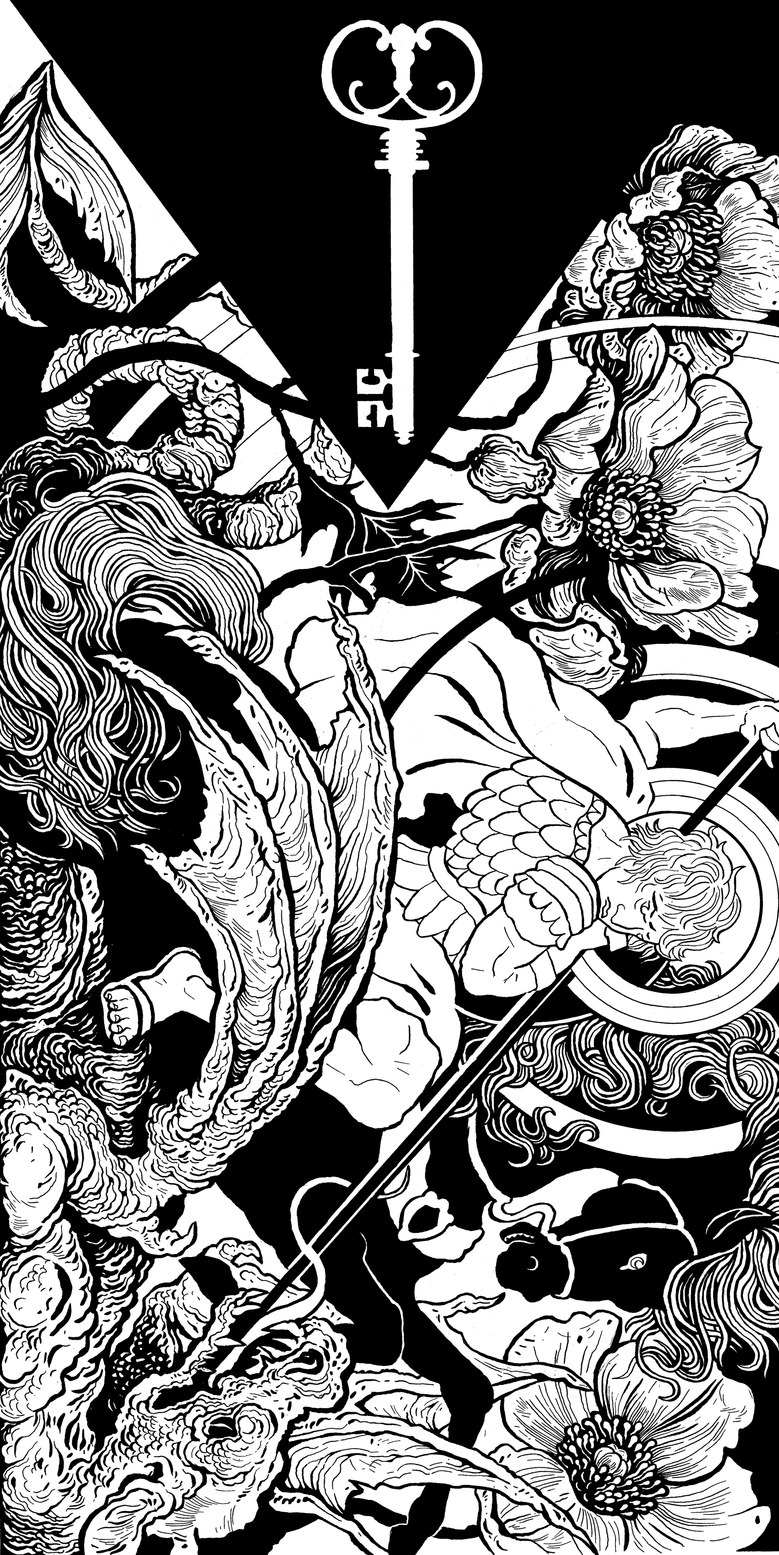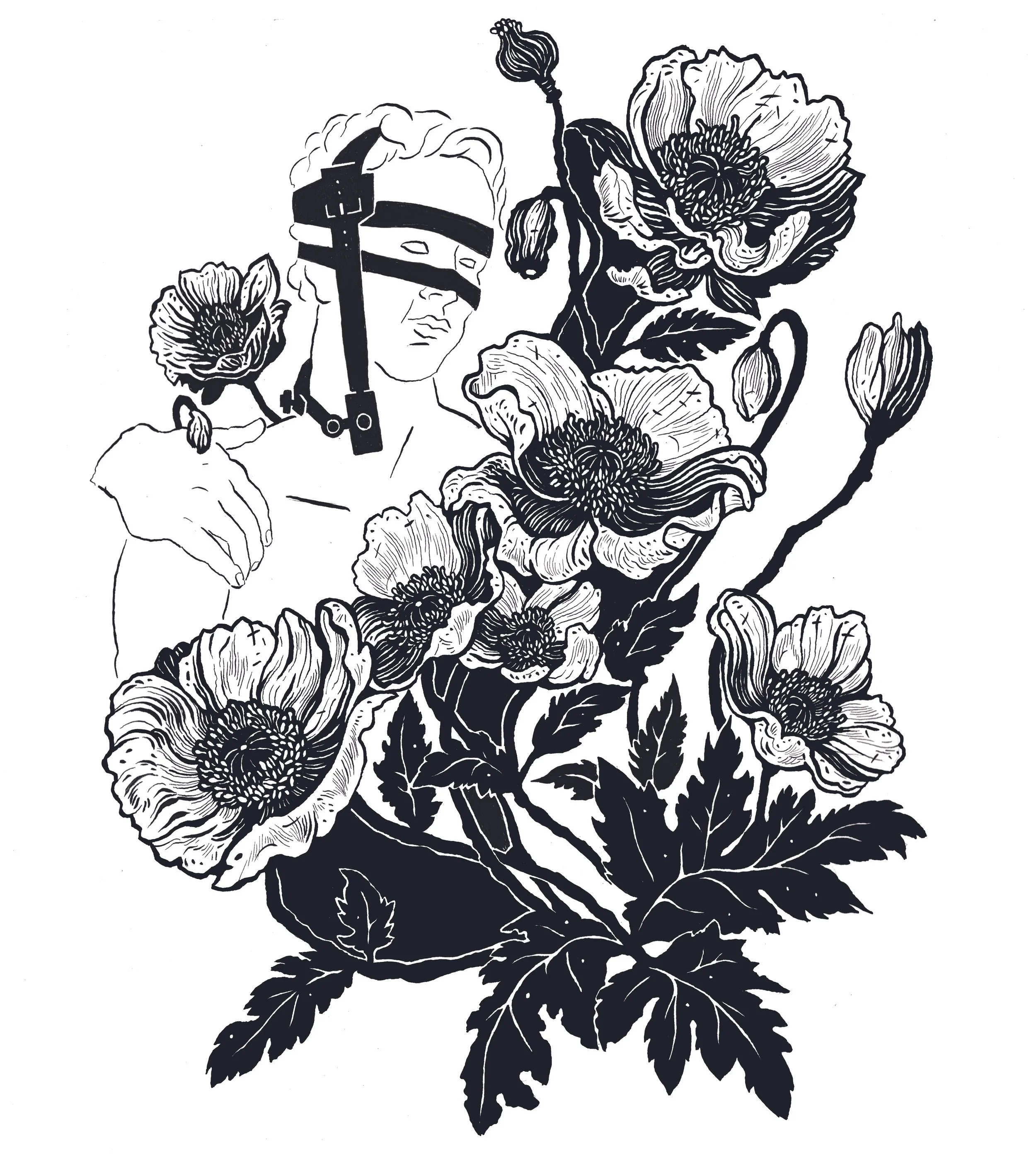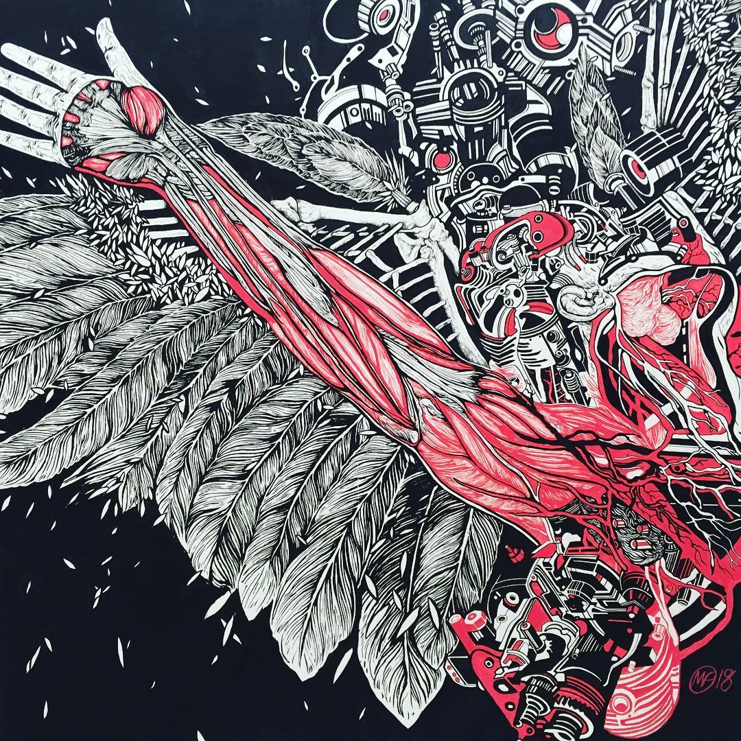
A Flag for a Nation of Neighbours is part of The Fête of Britain, a nationwide campaign celebrating the diverse cultures thriving in the UK. The campaign invites communities to take part in shaping the places where they live - through festivals, arts, and grassroots organising.
My flag design, Ascalon, reclaims St. George from his use as a tool of intimidation - long before his adoption by England, he was a Palestinian Saint revered across the Middle East as a symbol of peace and defiance - his cross a common sight there, and George a popular Palestinian name. I juxtapose the dragon-slayer against the 1916 Arab Revolt, the Nakba Key, and the poppy, a flower synonymous with Palestine.
The Flags project runs over three years with nationwide exhibitions, festival partnerships, and a major London show, culminating in a printed publication capturing the designs and stories behind the campaign.
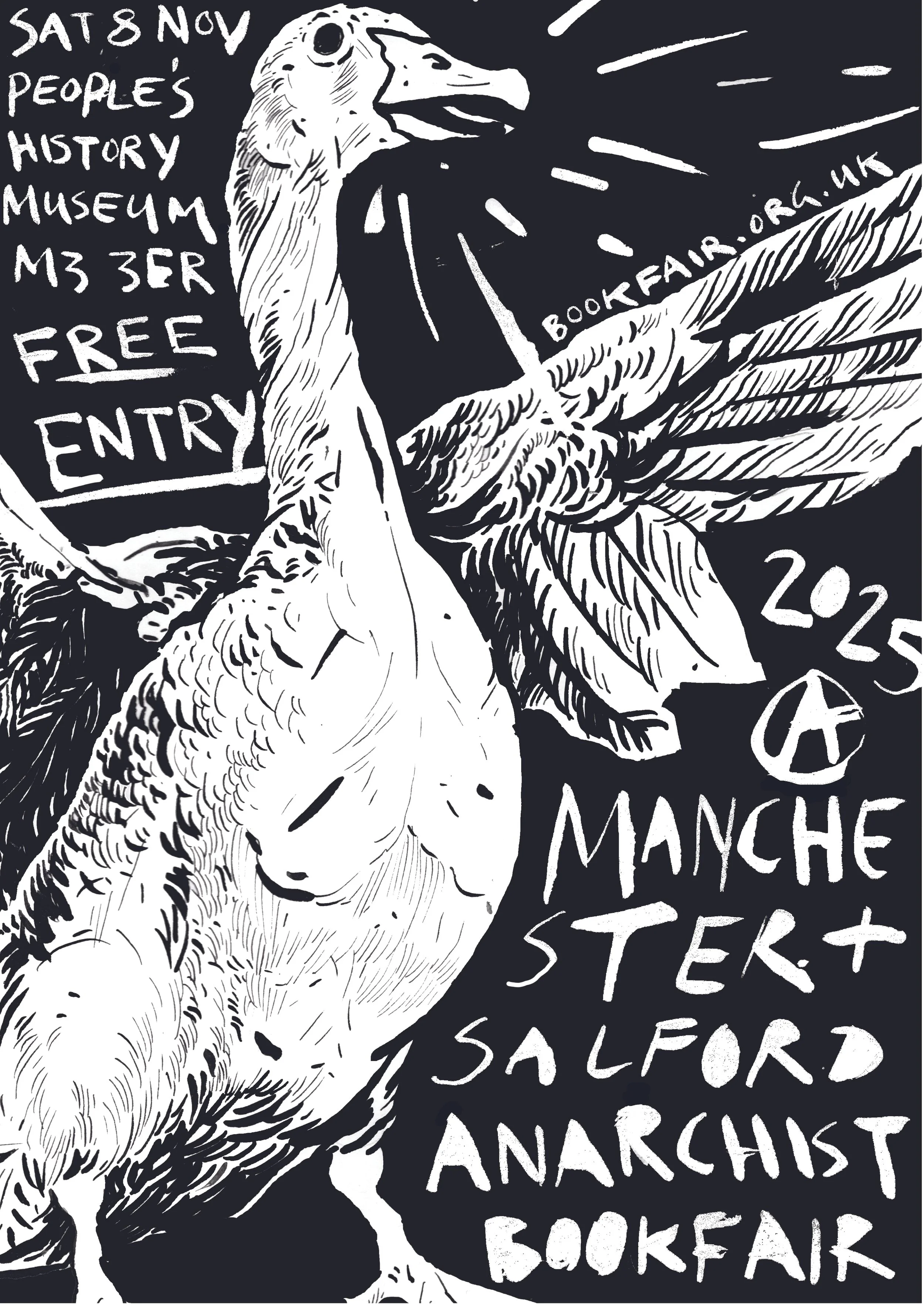
I have been a regular contributing illustrator to DOPE Magazine, a quarterly publication distributed for free to be sold on the streets by homeless and precarious vendors, who keep all proceeds from sales. The magazine is run on anarchist principles and focuses on raising awareness of injustice while building toward radical social change, publishing first-hand accounts and opinion from established writers and marginalised voices alike.
My contributions have covered a range of subjects, including psychiatry, prison aboltion, addiction, industrial strikes, disability, and the influence the 1871 Paris Commune had on socialist politics in Britian.
All copies of DOPE are availible as free PDF downloads, and can be found here.
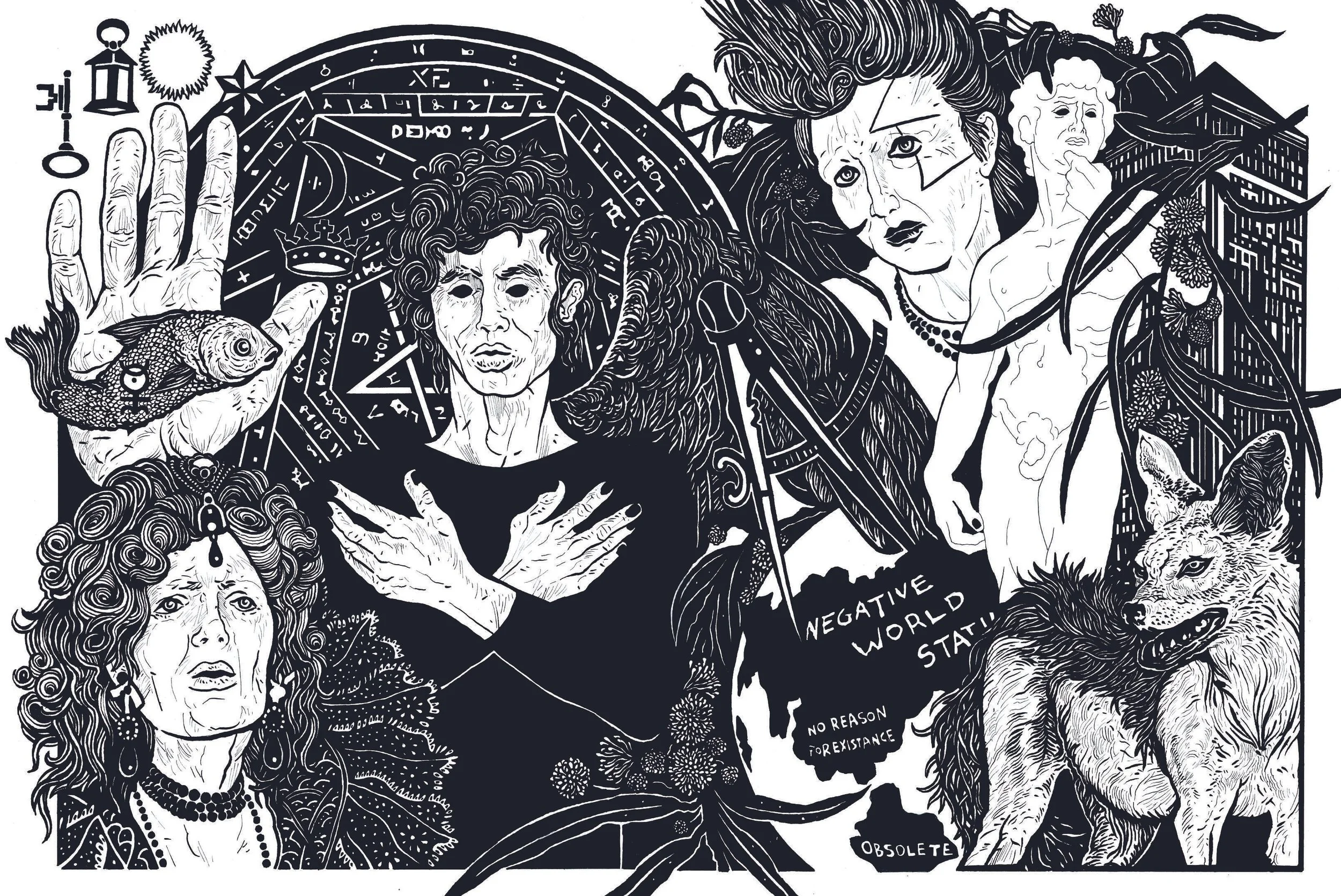
I have served as an illustrator and writer for Left Cultures, a magazine devoted to examining the cultural history of the left through film, music, literature, art, and poetry.
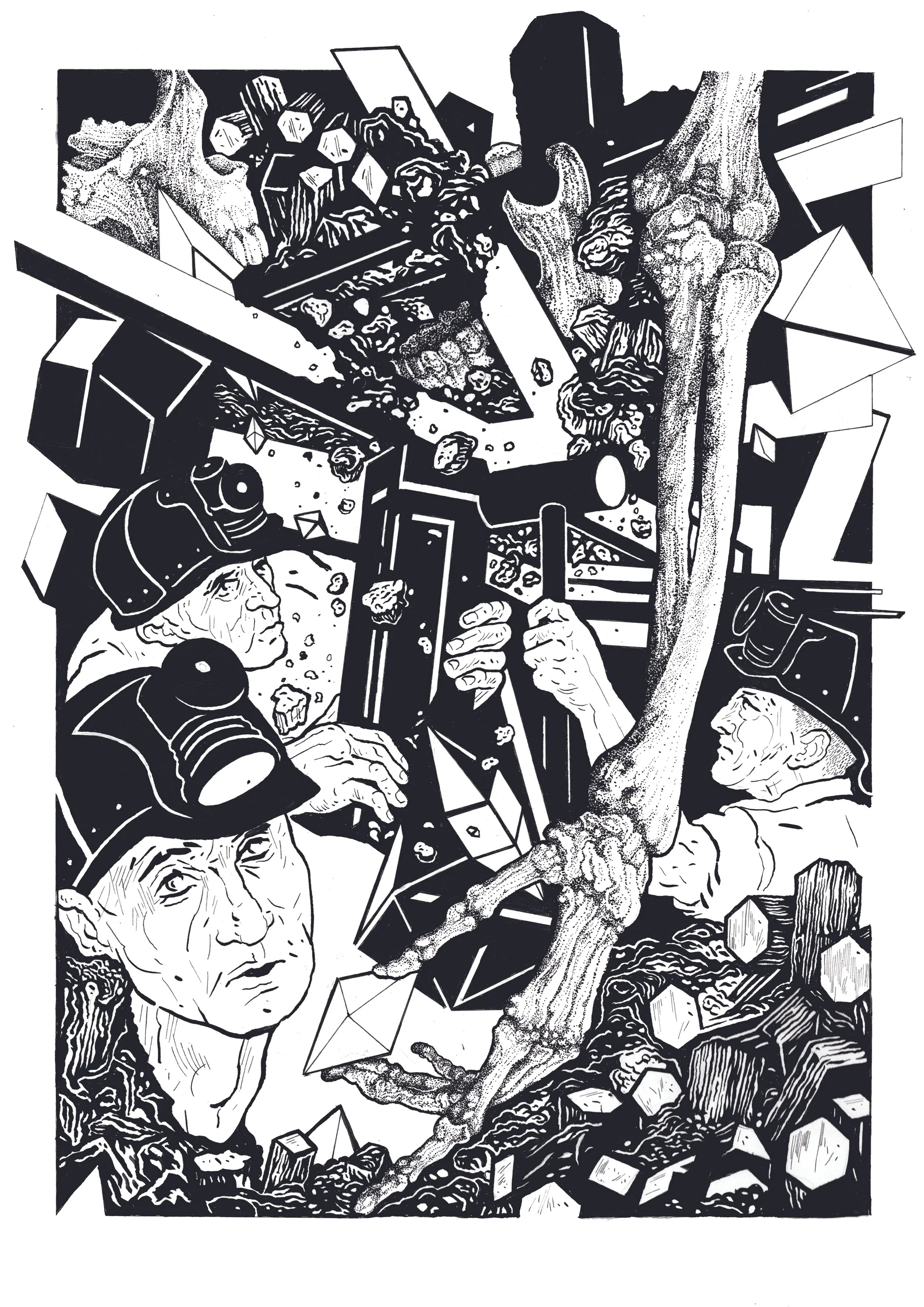
My contributions include an illustration accompanying an essay by the writer Dan Evans on his grandfather, a socialist miner, and an accompanying article and illustration exploring the influence of Greil Marcus's Lipstick Traces on my own artistic practice. For the magazine's 2026 edition, I produced an illustration for a piece by Vandal Factory Podcast on the band Lunatraktors.
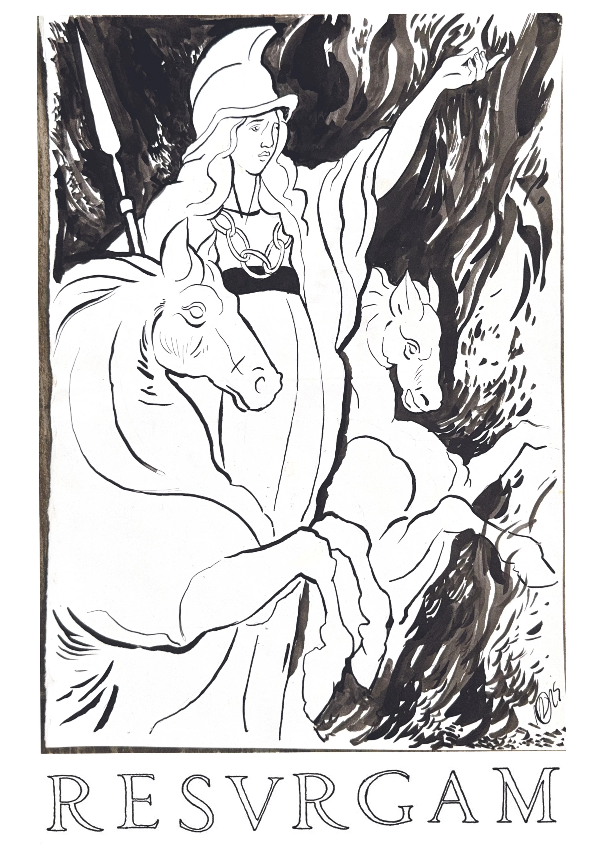
The Right to Protest, curated by Museum of UnRest and Pro Radix, brought together rare protest posters from two of the UK's leading private collections alongside new commissions, exploring the enduring relationship between design and dissent. The exhibition ran 18–28 September 2025 at Greatorex Street, London, as part of the Shoreditch Design Triangle and London Design Festival, and subsequently at Rockaway Park, Bristol, in 2026
For my contribution, I drew on the layers of fire and protest embedded in the London’s history. In 61 AD, Boudicca burned London to the ground in revolt against the occupying Roman legions, leaving a seam of oxidised red clay still visible in the soil today.
That same red clay is said to have been used by striking dockers in 1889 to dye the first red flag, tracing the modern symbol of workers' solidarity back to a pagan uprising against a ruling elite. The poster reworks elements of the Boudicca statue that stands outside Parliment, and John Opie's portrait of her, incorporating RESVRGAM - "I will rise again" - the motto Christopher Wren built into his redesign of St Paul's after the Great Fire.
Client Tara Books
Design Dhwani Shah, Laura Nogueira
The Kadar are a small tribal community who live in the Annamalai Flats of South India. These books are a tribute to their ways of living and understanding the forest, interweaving tribal creation myths with the story of a city-dweller seeking to undertand the bio-diveristy of their home.
completed during a residency at Tara Books in Chennai, South India, and the illustrations are avilible as art-prints produced in Tara Books screen printing studio in Chennai, and were employed as a backdrop for the London pop-up restaurant event, Pergola on the Roof White City. The were addtionally recognised by the 3×3 International Illustration awards 2016.
An interview on the process of illustrating these two books, conducted by Sustainibilty Zero, can be found here.
Press
Client: Blackbook Winery
Design: Yarza Twins
Label design for a limited edition wine produced by Blackbook Winery.
More information on the design process can be found here
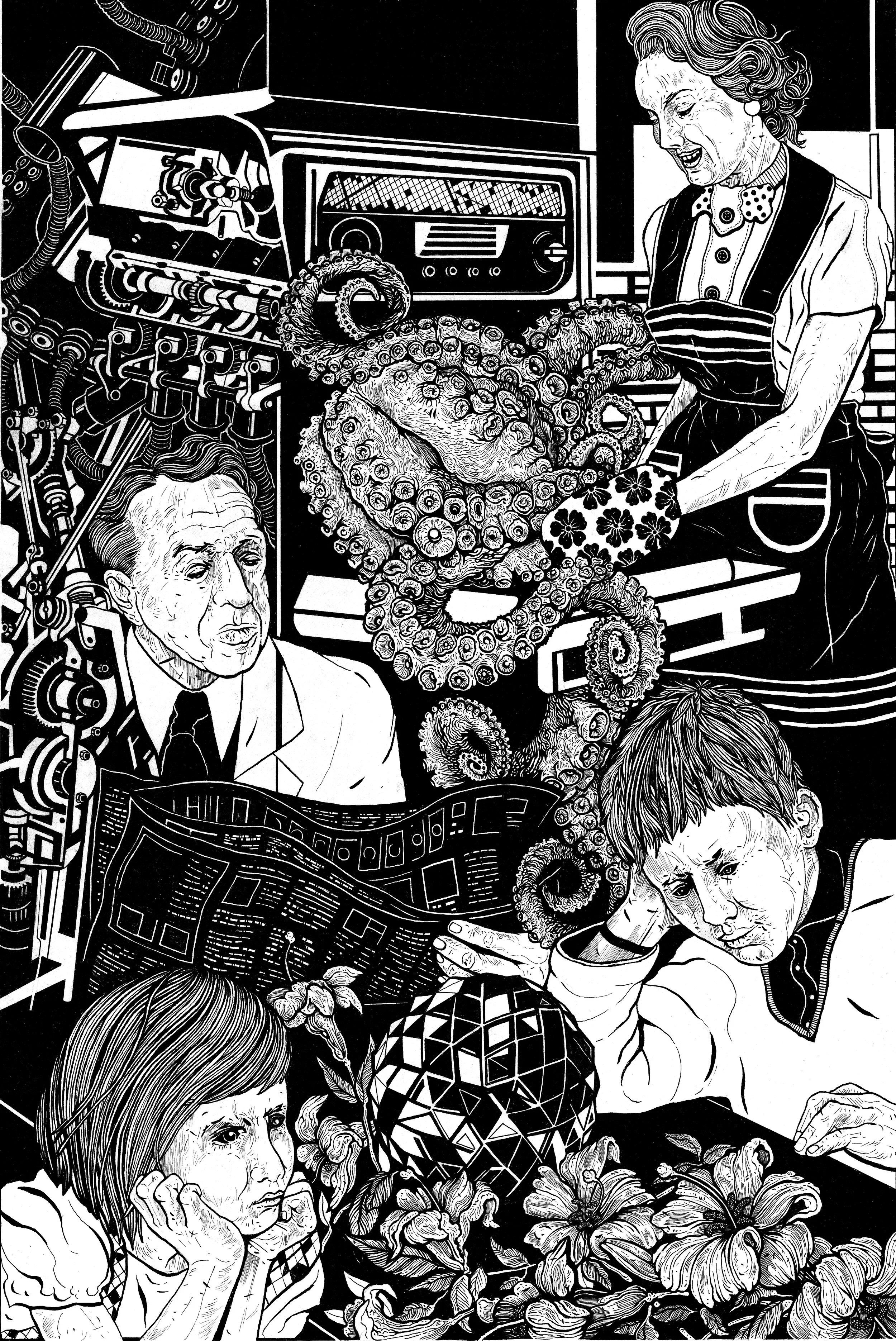
Editorial illustration commissioned by the Wellcome Collection. The article, by Ken Hollings, details the rise of extraterrestrial teenagers in pop culture during the Cold War.
Client Strange Attractor Press
Design Rathna Ramanthan
Longlisted for The Global Illustration Awards 2016
Ken Hollings is a writer, broadcaster, cultural theorist and lecturer based in London. His book, The Bright Labyrinth, is a subtle and disturbing account of how technology has impacted upon human culture.
The book draws upon a variety of sources - architecture and film, avant-garde art and critical theory, military strategy and machine intelligence to expose the network of information that surrounds and influences our daily lives.
Client Tara Books
Design Rathna Ramanathan
Honour Title, South Asian Book Awards, 2015
Official Selection, White Raven 2016
The Boy Who Speaks in Numbers is a darkly satiric account of childhood in times of war. Set in Sri Lanka, the events it narrates could equally happen elsewhere - in all places where human deaths are reduced to numbers, and where guns do not differentiate between adults and children.